
In the captivating world of food photography, plating food is not merely an afterthought—it’s an essential skill that can transform your images into a visual feast. Have you ever wondered how industry professionals turn ordinary dishes into stunning pieces of art?
Are you ready to unlock your culinary creativity and master the art of plating food for photography that captivates the eyes and the palate? If so, you have landed at the right place. This article is designed to provide you with essential tips and techniques to take your food presentation to the next level.
Prepare to embark on a culinary adventure that promises not only to enhance your photographic skills but also to tantalize your taste buds. The journey towards creating mouthwatering, photograph-worthy dishes begins here.
Here’s what we will be covering in this article
1. The Art of Composition: Setting the Stage for Eye-Catching Food Photography
2. Color Schemes in Food Presentation: How to Create Visually Pleasing Dishes
3. Nailing the Textures: How to Play with Texture for Depth and Interest
4. The Role of Garnishing in Plating: Enhancing the Dish Appeal
5. Lighting and Angles: Mastering the Final Touches for Professional Food Photography
The Art of Composition: Setting the Stage for Eye-Catching Food Photography
The composition is a crucial aspect of food photography that encompasses the arrangement of visual elements within a frame. It’s not just about the food; the art of composition considers the positioning of the dish, utensils, tablecloths, and other elements to create a captivating scene.
Here are few techniques and tips to guide you in perfecting the art of composition:
1. The Rule of Thirds:
Divide your image into nine equal sections by two equally spaced horizontal lines and two equally spaced vertical lines. The case for placing the subject or other critical elements of your photograph along these lines, or their intersections.
2. Balancing Elements:
When arranging your shot, consider the composition’s balance. Balance does not necessarily mean symmetry, but the distribution of visual weight in an image. Would introducing a small element offset a larger item?
3. Utilizing Negative Space:
Negative space refers to the empty areas in and around your subject. It can enhance your food’s appeal by creating a feeling of openness and clarity.
4. Experimenting with Angles:
While the most common angle for food photography is shooting from directly above the dish, feel free to experiment with different angles. For example, a side angle can create more depth, while a 45-degree angle often replicates the diner’s point of view.
5. Adding Layers:
Layers add depth and interest to a photograph. This could include a cloth under the plate, a chopping board, cutlery, ingredients, and even shadows.
No two food stylists will compose a dish in precisely the same way. Don’t be afraid to experiment and be creative with your compositions. Remember, the goal is to make the food look delectable and invite your viewers to dive right in.
Keep practicing and take plenty of shots from different angles. Over time, you’ll come to understand what you like and develop your style. With composition playing such a crucial role in the outcome of your food photographs, putting extra emphasis on this aspect will push your skills to the next level. In the highly competitive industry of food photography in Singapore, honing your sense of composition will give you a significant edge.
Color Schemes in Food Presentation: How to Create Visually Pleasing Dishes
The art of presenting food is not only about arranging items on a plate, but is also about creating a harmonious color palette that enchants the viewer’s eyes and stirs their appetite. Develop a knack for using color in food presentation and your dishes will stand out with an appealing visual vibrancy.
The Science of Color in Food
Before diving into the tips to use color effectively, it’s important to understand the science behind it. According to research, color plays a crucial role in our food-related experiences. Some colors are generally associated with specific tastes, while others may influence our perception of a food’s freshness and appeal. For instance, green is often linked to fresh and herbaceous tastes, while red is commonly related to sweet or spicy flavors.
1. Balance Warm and Cool Colors
- Warm Colors: Colors such as red, orange, and yellow are warm colors. They are stimulating and often associated with hearty and comfort foods. Use warm colors to make a dish appear warmer and comforting.
- Cool Colors: Colors such as green, blue and violet are cool colors. They often evoke refreshing and muted experiences. Use cool colors to make a dish look more refreshing and light.
Maintain a balance between warm and cool colors in food presentation. Too much of either can be overwhelming. A combination of both can help create visually impactful dishes.
2. Consider Color Contrast
Color contrast can make your food look more appealing. For instance, a brightly colored garnish can stand out against a dish with a darker or neutral color. Try to use contrasting colors that are on opposite ends of the color wheel, like orange and blue, or red and green.
3. Mind the Color of the Plate
Don’t overlook the color of your plate or serving dish. The plate color can either enhance or diminish the visual appeal of your food. Aim for a plate color that complements the food without overshadowing it.
4. Natural Colors Work Best
While artificial food coloring can sometimes be used to achieve certain visual effects, natural food colors are the best choice for creating visually pleasing dishes. Not only are they more visually appealing, but they are also healthier.
5. Understand the Cultural Contexts of Colors
Colors carry different meanings in different cultures. For instance, in some cultures, red is considered auspicious, while in others it’s a sign of danger or warning. Being aware of cultural meanings associated with colors can be useful, especially when you are serving food for an international audience or are dealing with specific occasions or festivities.
Remember, creating a visually appealing plate isn’t just about making food that looks good. It’s also about creating a dish that stirs the viewer’s appetite and leaves a lasting impression.
Nailing the Textures: How to Play with Texture for Depth and Interest
In the world of food photography, texture plays a pivotal role. Not only does it add depth and interest to a photograph, but it also stimulates the viewer’s senses, evoking a tangible sense of taste and touch. Mastering the manipulation of texture can significantly enhance the aesthetic appeal and intrigue of your culinary shots. Let’s delve into the art of playing with textures to bring your food photography to life.
1. Understanding the Importance of Texture in Food Photography
Texture in food photography acts as a visual ingredient that makes your images more relatable and realistic. A successful food photographer knows how to emphasize the texture of each ingredient, from the delicate fluffiness of a pastry to the crisp snap of fresh lettuce. This ability to highlight and celebrate texture creates a dynamic composition that entices the viewer.
2. Choosing the Right Props to Highlight Texture
Props can add character to your food photography and accentuate the texture of your culinary creations. The selection hinges on the food itself – a matte surface might be ideal for shiny, greasy foods, while glossy plates can complement dry, textured meals. Simultaneously, the use of cutlery and napery can add varying layers of texture, adding complexity to the image.
3. Mastering the Technique of Shadow and Light Play on Textures
Natural light is a powerful tool that, when used correctly, can emphasize the textures, creating extraordinary photographs. Shadows can illustrate the depth and three-dimensionality of the food, while gentle lighting can make the textures pop. Experimenting with different lighting and shadow techniques can produce a diverse range of effects, making your photos more versatile and interesting.
4. Incorporating a Variety of Textures
While texture is important, repetition can lead to monotony. An effective food photography composition often incorporates a variety of textures, both in the food itself and the surrounding scene. Experiment with adding ingredients with contrasting textures – pair soft, gooey cheeses with crispy crackers, for instance, or silky soups with crunchy, toasted bread.
These practices, when executed with precision, can make your food photography stand out. By mastering the art of texture incorporation, you can add another layer of complexity to your shots, enhancing their overall impact. Remember, great food photography is not just about making the viewer hungry, but about creating an image that excites the senses.
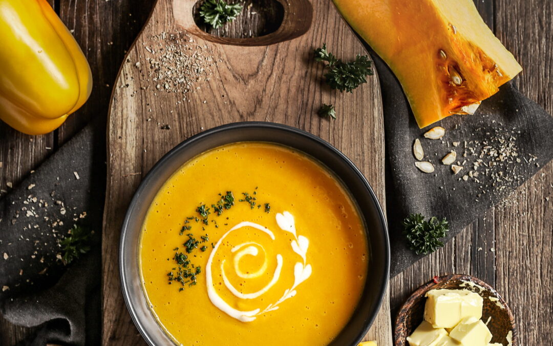
The Role of Garnishing in Plating: Enhancing the Dish Appeal
The garnishing of a dish may seem like an afterthought, a few sprinkles of herbs or a drizzle of sauce, but in professional food photography, every detail is significant and garnishing plays a crucial role in the entire dish presentation.
1. The Importance of Garnish
- Stimulates Appetite: A well-garnished dish instantly stimulates the appetite. The colors, textures, and arrangement of the garnish make the dish attractive and tempting.
- Adds Value: Garnishes add value to the food presentation. It is not just about making the dish look good, but also enhancing its taste and aroma.
- Shows Expertise: The way a dish is garnished reflects the expertise and creativity of the chef or food stylist..
2. Techniques for Garnishing
While garnishing is seen as an artistic endeavor, it does have its techniques. It is not only about throwing some herbs on a plate; there are methods to arrange the garnishes properly.
- Color Contrast: Contrasting colors can immediately catch the viewer’s eye. Combining colors wisely can enhance the overall look of the dish.
- Texture and Size: Different textures and sizes can add depth to the presentation. Smaller garnishes like sesame seeds can create a different effect compared with bigger ones such as fresh herbs.
- Placement: Where you place the garnish matters. It needs to highlight the main part of the dish and not distract.
3. Types of Garnishes
There are multiple types of garnishes that can be used in professional food photography.
- Herbs: Fresh herbs such as parsley, dill, basil, or mint add a pop of color and freshness to the dish.
- Fruits and Vegetables: Fruits and vegetables can be cut into different shapes and add contrasting color to the plate, instantly making the dish visually appealing.
- Nuts and Seeds: Nuts and seeds give a crunchy texture to the dish and also add a rustic touch to the presentation.
- Sauces: Different types of sauces can be used for garnishing, either drizzled over the dish or served on side.
In professional food photography, garnishing serves a greater purpose in food plating and presentation. It is an art to be mastered to create visually appealing and mouthwatering food images. So, when you’re next decorating a dish, remember that a well-thought-out garnish goes a long way in creating an appealing image.
Lighting and Angles: Mastering the Final Touches for Professional Food Photography
Just as chefs artfully employ various ingredients, textures, and garnishes to create a tantalizing meal, professional food photographers in Singapore also leverage the elements of lighting and angles to present dishes in the best possible light and perspective. A simple change in light or a slight tilt of the camera can dramatically change how the food appears, and therefore, influences the audience’s perception of the dish.
Key Aspects of Lighting in Food Photography
- Understanding Natural Versus Artificial Light: The choice between these two types of light sources typically depends on the environment you’re shooting in and the mood you’re trying to evoke. Generally, natural light provides softer and more diffused illumination, which can make your food appear more natural and appealing. On the other hand, artificial light gives you more control over the intensity and direction of the light.
- Appreciating the Importance of Light Direction: The angle of the light relative to the food can make a significant difference in the look of your photograph. For instance, backlighting accentuates both the colors and textures, creating a contrast that increases the appeal. On the other hand, side lighting can cast beautiful dramatic shadows that accentuate the texture of the food.
- Mastering the Use of Shadows and Reflections: Minor tweaks in lighting can lead to changes in shadow and reflection, which can add depth and intrigue to your food photographs. A good combination of shadows and reflected light can help emphasize the textures of the dish and create a sense of dimension.
The Impact of Angling in Food Photography
- Top-Down Shots (Overhead Shots): This is the go-to angle for many food photographers. Not only does it eradicate the issue of background clutter, but it also works well with flat lays, showcasing various elements of the meal at once.
- 45-Degree Angle Shots: This popular angle emulates the diner’s perspective. It’s often used when the food has some height or when there are elements within the dish that can’t be captured from overhead.
- Straight-On Shots: A straight-on angle helps highlight dramatic layers, as seen in burgers, sandwiches, or layer cakes. This perspective can also emphasize the depth of field, thereby creating a sense of depth and drama.
By understanding and mastering these elements of light and angle, you’ll not only elevate your food photography skills, but also discover a new realm of creativity.
Transforming your food photographs from attractive to captivating resides in these details. Experimenting with these parameters can result in more visually compelling shots that convey the appetizing nature and true essence of your culinary creations.